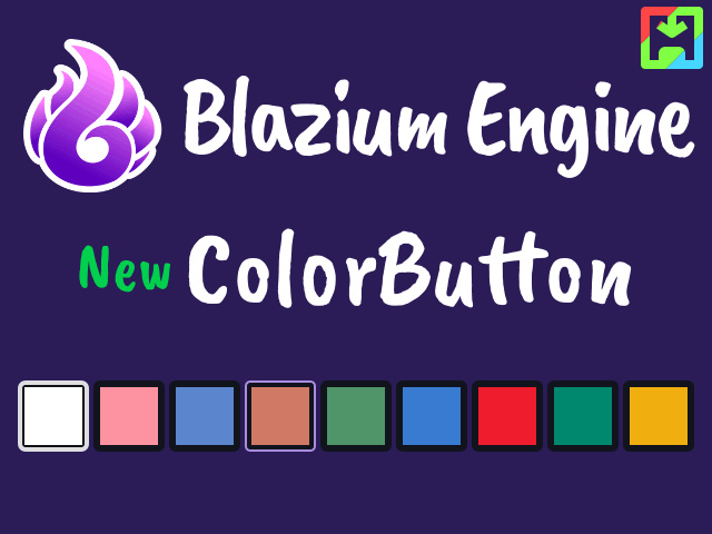
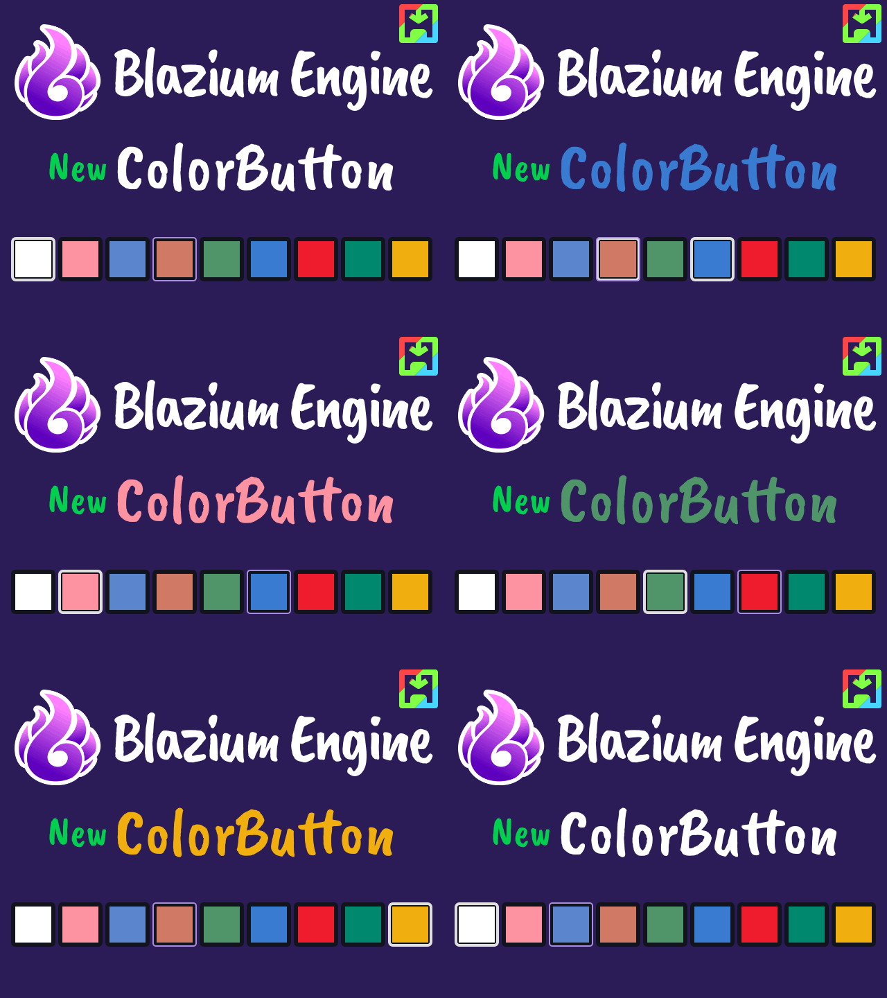
The Color Button node is a lightweight control with a color property. It displays a single color and triggers user-defined actions when pressed. This makes it particularly useful for creating color palette selectors or custom UI elements. The node is also used internally by the engine to replace the old swatches buttons in the ColorPicker.
This node Extends BaseButton, which means it doesn’t have text or a child
ColorPicker popup like the ColorPickerButton node. It is meant to be used as a
color selector and by default it doesn’t do anything unless the user implements
the functionality himself. It can be used for color palettes, drawing and
painting tools, UI customization and more.